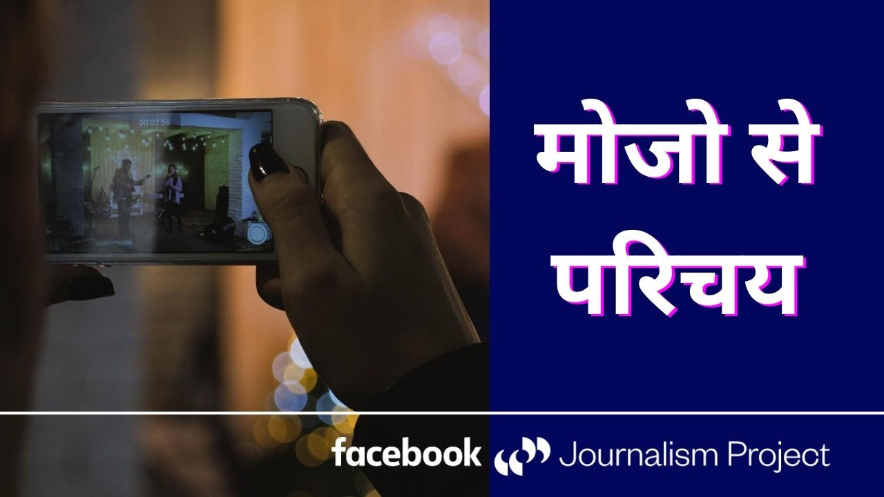
Don’t miss the upcoming Mobile Journalism workshop in Hindi, hosted by the Facebook Journalism Project. In this session, freelance journalist Sanshey Biswas will cover how to shoot and edit videos on the phone. If you’ve always wanted to learn more about how to use your phone to make content, this webinar is for you. It will be hosted in the Facebook Journalism Project India group on Wednesday, August 26th, and is open to all journalists in India.

Creating content on phones (aka Mobile Journalism for the journalists following this newsletter) is one way to better empathise with how your audience will consume your work. For example, if you’re adding text to a photo, video, or Story, it will be easier to read if you’ve made the text size large enough for a phone screen. It’s much harder (but not impossible) to ensure your text is legible on a phone screen when you're creating on a desktop.
But this isn’t the only way to make your work more accessible. As journalists, we often strive to make sure that our work reaches as many people as possible. And we can do that by offering our stories in multiple languages, and also making sure that people who are hard of hearing and visually impaired can follow along.
So let’s look at some things we can do to improve the accessibility of our stories.
Subtitles
Platforms like Facebook and YouTube allow you to upload subtitle tracks in multiple languages. This is especially helpful if you have an audience that speaks multiple languages, like Hindi and Punjabi or English and Bengali. Here’s a useful tutorial from Sanshey published in Journalism.co.uk for how to make a subtitle track in .srt format using YouTube. You can upload this .srt file onto Facebook Creator Studio when you’re getting ready to publish.
The .srt files are also helpful for both people who are hard of hearing and those who are visually impaired. The format allows those who are hard of hearing to follow an interview or bite in a video. For people who are visually impaired, the .srt file can be “read” by a screen reader that helps the person navigate the web.
There’s also the added benefit that many people watch videos on silent, so if you have subtitles, they can keep watching your video even if they can’t get to their earphones right away. The same logic applies to subtitling your Stories if you’re speaking to camera.
For podcasts, add a transcript in the description of your podcast for people who are deaf or hard of hearing.
Optimising for Screen Readers
Have you noticed people adding photo descriptions on Instagram, in addition to their caption? This allows screen readers for people who are visually impaired to read out the photo to the person using it. Social media creator Megan Jayne Crabbe and Annie Segarra have a great list of tips for how to make your Instagram more accessible here.
For hashtags that include multiple words, it’s important to capitalise the first letter of every word so the screen reader can identify each word as separate. So if you want to make your hashtags more accessible, you would write #MobileJournalism instead of #mobilejournalism.
Twitter recently added an option to add “alt text” to the photos you post, where you can add the text for visually impaired people.
Start Learning About More Inclusive Language
Using gendered job descriptions like “spokesman” or “fisherman” or “lady cop” can both alienate your audience and be inaccurate. Opting for more gender-neutral terms can make your stories more inclusive. And don’t assume that a person you’re interviewing identifies as a specific gender. It’s important to ask people how they identify themselves so that your reporting can be more accurate.
Sometimes, inclusive terms change to become more inclusive. So it’s important to keep learning and keep asking people what is important to their identity so that you can make sure you’re not imposing your prejudices on the people you’re interviewing and featuring.
Think About Colours
When you’re adding text or making graphics, it’s important to think about colours that are accessible to people. So making sure there’s a lot of contrast is helpful. And on graphs, avoiding colours that can be hard to tell apart, like red and green, allows people who are colourblind to understand the data you’re presenting them with.
These examples of how to make your work more accessible are just a start. If you have more examples, write to us!
ABOUT THIS NEWSLETTER
This newsletter is an attempt to keep up and share all the latest and greatest stories in media and how they get done. Read about it here: About In Old News-Letter
And if you were forwarded this newsletter, here’s how you can sign up to get the latest editions as they come out!
